

1
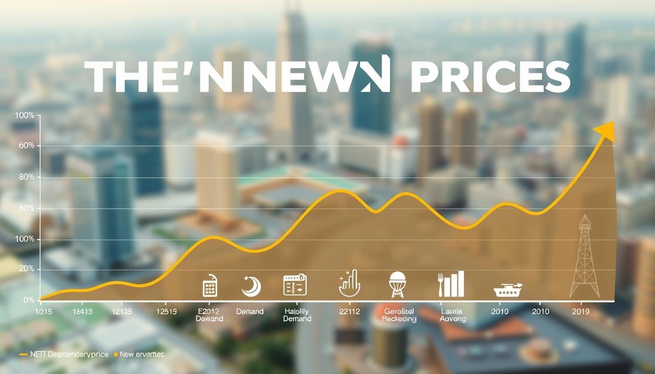
Die “neue Normalität” der Energiepreise – Und wie Sie sie zu Ihrem Vorteil nutzen
stromfee.ai@gmail.com
- November 12, 2025
- 0 views
2
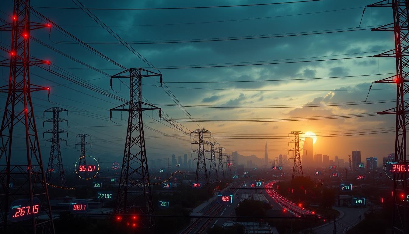
Strommarkt vor einem Paradigmenwechsel: Statt Stundenpreisen gibt es künftig 96 Preissignale am Tag
- November 2, 2025
- 0 views
3

Solarpower im Detail: Die beeindruckenden Leistungsdaten unserer 664-kW-Photovoltaikanlage
- August 5, 2025
- 0 views
4

# Energieanalyse: Leistungsbilanz unserer 1000-kWp-Photovoltaikanlage
- August 4, 2025
- 0 views
5

# Sonnenpower im Detail: Leistungsdaten und Effizienz unserer PV-Anlage
- August 3, 2025
- 0 views
6

# Sonnenernte im Überblick: Unsere PV-Anlage auf Höchstleistung
- August 2, 2025
- 0 views